Understanding the Healthatize Pie Chart: Visualizing the Nutritional Impact of Every Bite
Learn how the Healthatize Pie Chart helps you visualize the nutritional breakdown of your food. Discover what a balanced pie chart looks like and how to make healthier choices with every bite.
HEALTH AT A GLANCEEXTENSION FEATURESHEALTHY CHOICES
Healthatize
8/16/20243 min read


In today’s world, where convenience often trumps nutrition, it's easy to lose sight of what we’re actually consuming. The Healthatize Pie Chart is a powerful tool designed to help you visualize the nutritional breakdown of your food in a simple and intuitive way. By understanding what’s in every bite, you can make more informed choices and take control of your diet.
What is the Healthatize Pie Chart?
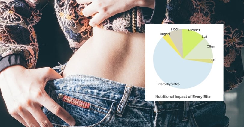
The Healthatize Pie Chart is a visual representation of the different macronutrients in the food you eat, including carbohydrates, fats, proteins, sugars, fiber, salt, and other components. This chart helps you see at a glance how your food is composed, making it easier to understand the impact of each bite on your overall diet.
Each section of the pie chart corresponds to a specific macronutrient, with the size of each section reflecting its proportion in the food. The colors used in the chart are randomly assigned, ensuring that no single nutrient is always represented by the same color, adding a layer of variety and keeping the visual experience engaging.
How to Use the Healthatize Pie Chart
The pie chart is integrated into the Healthatize browser extension, allowing you to see the nutritional breakdown of foods as you shop online. Here’s how you can use it to make better food choices:
Compare Nutrient Proportions:
When looking at a product, the pie chart provides a clear visualization of its nutritional content. If one section dominates the chart, it gives you a quick indication of what you're consuming the most. For example, a large section representing fat might suggest a food item is heavy on fats.Understand What You’re Really Eating:
The pie chart makes it easy to visualize what your food truly represents. For example:A mostly fat pie chart might resemble eating a spoonful of butter—high in fat, low in other nutrients.
A mostly carbohydrate pie chart could indicate a food item similar to white bread—quick energy but lacking in protein and fiber.
A balanced pie chart, where proteins, carbs, and fats are nearly equal, might represent a well-rounded meal like a grilled chicken salad with quinoa.
Quick Decision-Making:
The visual nature of the pie chart allows you to make quick decisions without needing to analyze detailed nutritional labels. This is especially helpful when you’re in a hurry or need to compare multiple products quickly.
What Does a Healthy Pie Chart Look Like?
A healthy pie chart often shows a balanced distribution among the key macronutrients—carbohydrates, fats, and proteins. Ideally, a healthy meal might show a nearly equal or moderate balance, with none of the segments overly dominating the chart. Here's a breakdown:
Balanced Pie Chart:
Carbohydrates: 45-55%
Proteins: 15-25%
Fats: 20-35%
Fiber & Sugars: Present in smaller sections, contributing to overall health.
Such a chart indicates a well-rounded meal, providing energy, muscle support, and healthy fats. It’s the kind of pie chart you’d want to see regularly in your diet.
Why the Healthatize Pie Chart Matters
Understanding the nutritional impact of your food is crucial for maintaining a healthy diet. The Healthatize Pie Chart simplifies this process, providing a clear and immediate picture of what you’re consuming. This can help you avoid foods that are high in unhealthy components like excessive fats or sugars, and choose options that are more balanced and nutritious.
The Future of Healthatize Visual Tools
Healthatize is committed to providing tools that empower you to make better dietary choices. The pie chart is just one of many features designed to enhance your understanding of food. As we continue to develop the platform, we’ll introduce more visual tools that make healthy eating easier and more intuitive.
The Healthatize Pie Chart is a simple yet powerful way to visualize the nutritional impact of every bite you take. By incorporating this tool into your shopping routine, you can make more informed choices that support your health and well-being. Whether you’re trying to balance your diet, reduce sugar intake, or simply eat more mindfully, the Healthatize Pie Chart is here to help.
